
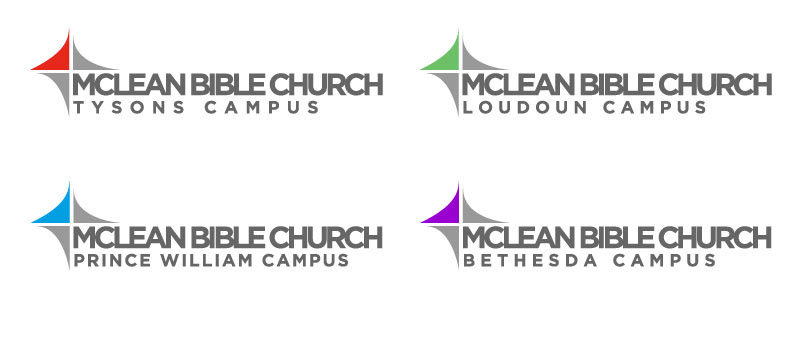
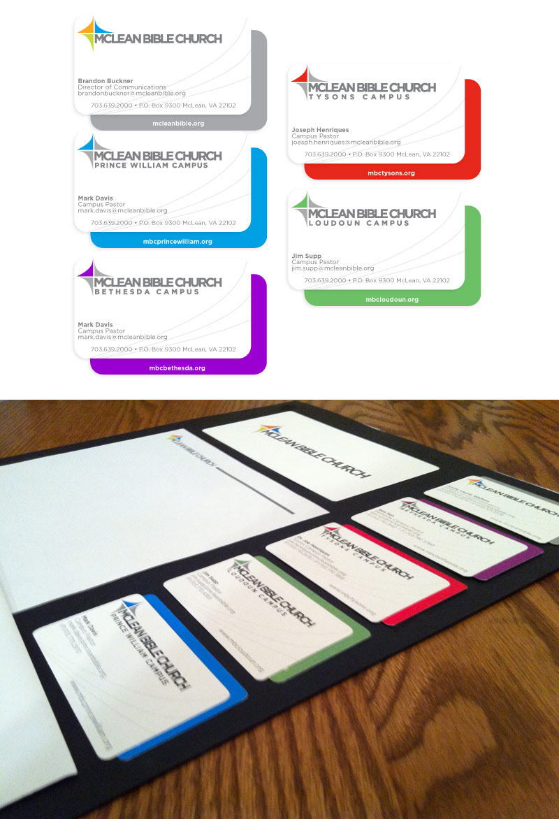
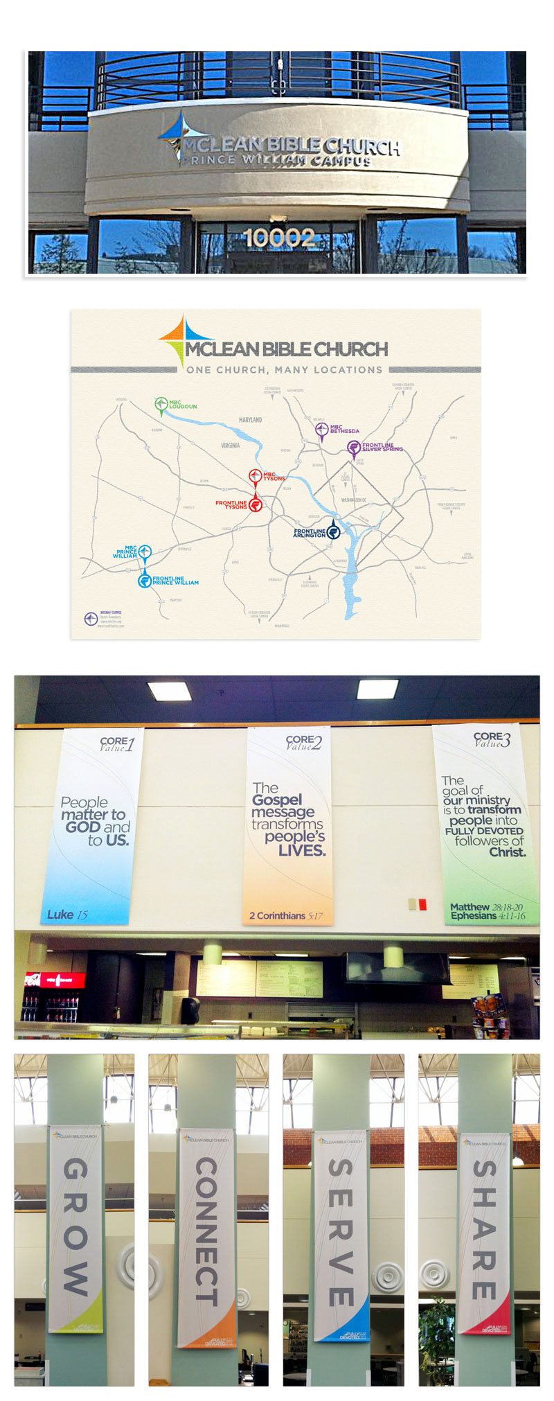
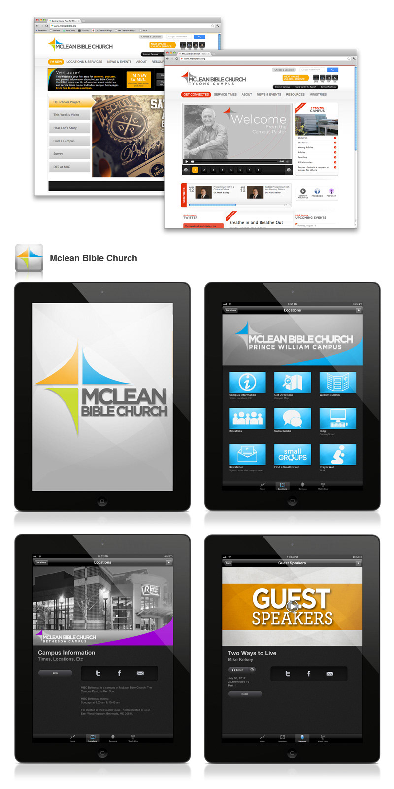


This is the Branding for McLean Bible Church. The main theme of the overall concept was “One Church, Many Locations” in which the logo represents. Each of the different colors represents a church campus, all coming together. The blue, orange, and green logo is the corporate logo for the church’s central operations. Each campus got to pick their own color. Their one color in the top left corner represents their part of the church. Each campus branding/color is followed through in all their print, web and social media. I have worked at McLean Bible Church since the beginning of 2008, and in 2009, I was charged to create the MBC logo. This shoes how the branding further developed today.